Kyoto Participation, Graphically
This map from Wikipedia, illustrating global participation in the Kyoto Protocol, is an effective graphic:
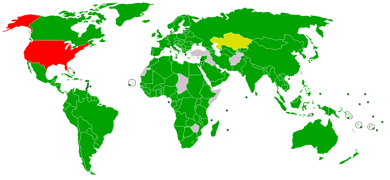
Green = signed and ratified; yellow = signed, ratification pending; red = signed, ratification declined.
James Mar 5
It’s a pity it doesn’t also distinguish between Annex I and developing countries. See also http://en.wikipedia.org/wiki/AP6
gary Mar 5
I thought Canada is closed to turning to “red” like its southern neighbour ?